Email Campaign Website
This is a UX/UI design for B2B email campaign company Wooshmail, an online email marketing service that helps small businesses and entrepreneurs easily create and send personalized email campaigns to their customers.
Introduction
WhooshMail was looking to improve the email campaign experience for small business owners and entrepreneurs. WooshMail wanted designs for two intuitive and easy-to-use flows for “Admin” and “Basic” users which shared similar screens and functionality.
Admin users - business owners who have the highest level of authority to access and manage email marketing campaigns
Basic users - users with access to a restricted set of features, and who need the approval of an Admin before sending out emails
I was tasked to complete the entire design process starting with user research, sketching, creating wireframes, user testing, and finally completing the project by creating high-fidelity design mockups.
Target Audience
Admins:
Mostly ages 40-60
Primarily based in the United States
Small business owners
High School/GED or Bachelor’s Degree
Pursuing their passions
Used their personal funds to get started
Basic:
Mostly ages 20-40
Primarily based in the United States
Work for a small business
High School/GED
Assumptions
Small business owners are interested in a simple and easy-to-use interface that helps them to get familiar with what is necessary.
Users prefer to use simple features with clear instructions.
Most users visit the site using desktop computers and tablets over fast and reliable wifi.
The Competitors
The Problems
There are quite a few email campaign competitors on the Internet. It’s important for me to review their offerings to see what key features I would need to be added to my design. I compared and analyzed what I liked and didn’t like about the product, so I can focus on the problems to solve in order to accomplish a better user experience result for my target users.
There are too many options with advanced features that make small business owners feel not necessary and expensive to use.
The instructions and process can be clunky and confusing. Users are frustrated when they don’t understand the tedious instructions, specific marketing phrases, or how to go through the process.
Business owners need the flexibility to assign different roles to their employees. They want to have a clear understanding of what features are available to each user role.
The Solutions
Create simple and easy-to-master features which help small business owners to complete their work quickly.
Make the instructions simple and clear, and the process straightforward enough for small business owners to use.
Have admin and basic users understand what features are available to each user role. provide two accounts associate with the same business to assign different user roles.
User Persona - Basic User
User Persona - Admin User
Storyboard - Basic User
Story Board - Admin User
Sketches- Basic User
Sketches - Admin User Role
Prototypes - Basic User Role
Prototypes- Admin User Role
User Testing
After completing the wireframes, I created interactive wireframe prototypes and arranged for user testing. I invited real users to complete the tests in person and via Zoom video chat.
Number of the participants: 5
Age: Between 25-40 years old
Task: Test wireframes of interactive prototypes (Admin and Basic roles)
Time duration: 5-8 minutes for each user role
Questions to Ask:
What are your overall thoughts on the prototype?
What worked well and what changes are needed?
Any other feedback or suggestions you would like to provide on the design?
Test Results:
Users were able to complete the interactive prototypes for the Basic and Admin user roles without running into any unexpected errors.
Users noted that the design contained all the key features they were looking for. The interface was well-organized, logical, and had a clear visual hierarchy.
Users could easily understand the differences and similarities of features between Basic and Admin roles.
Template editor seemed easy to use; each element was well grouped and positioned by type and category.
CTA buttons clearly guide and instruct users on how to complete their tasks.
Users liked the commenting feature of the template editor, which allows Basic users to review Admin feedback on specific locations of their email campaign.
Displaying the current email campaign template on the Add Recipients and Send Email pages gave users more confidence when working on their email campaign.
Users suggested displaying the email campaign template on the Admin Add Recipients page to be consistent.
Users mentioned some text fonts and icons need to be larger for easier readability.
Typography
Color Palette
Design Mockups - Basic User
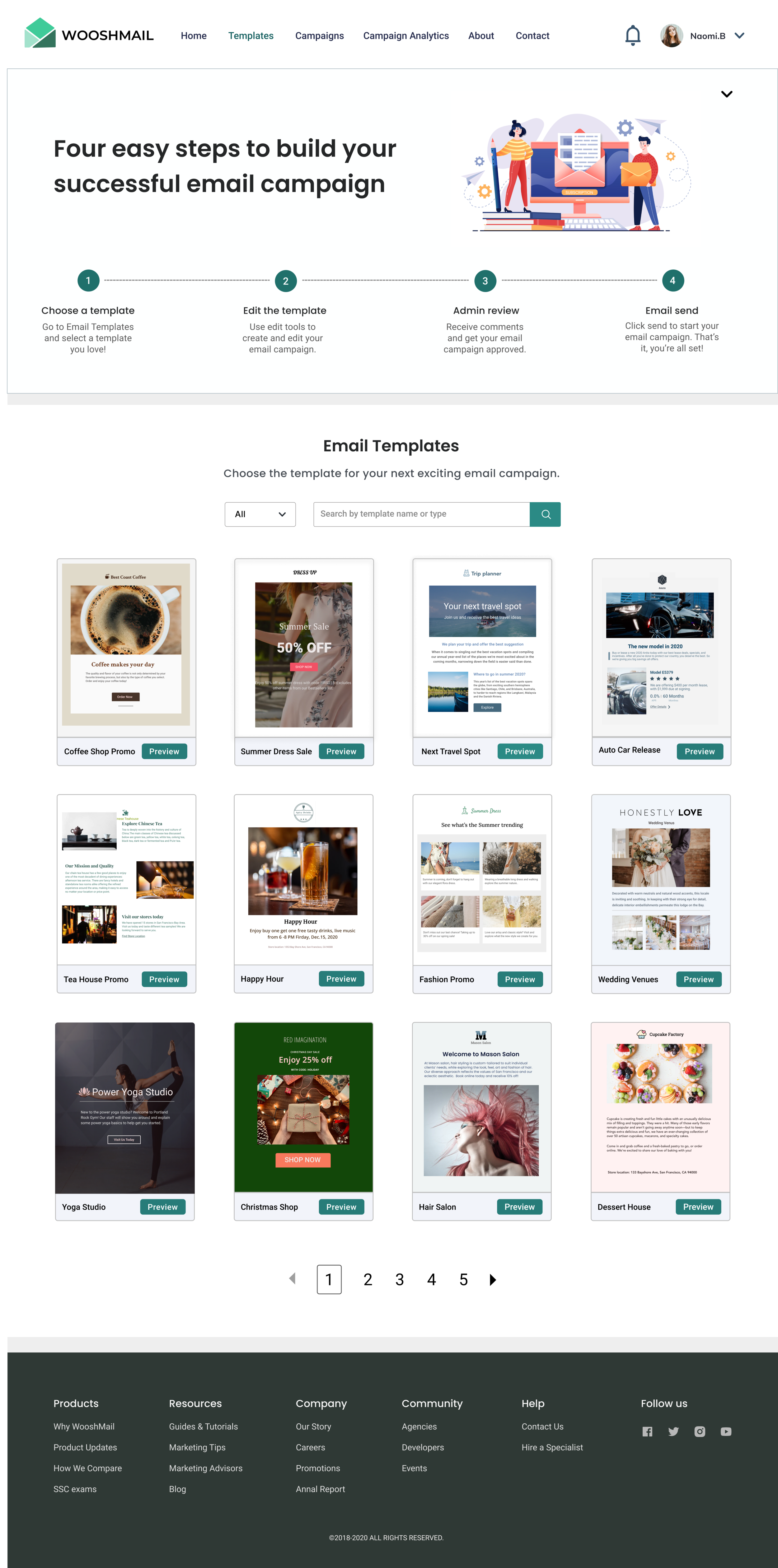
Template Gallery Page
This page allows basic role users to create a new email campaign using a selection of pre-made email templates. It also provides simple guidance to help new users quickly understand the entire email campaign process.
This page includes:
Navigation
Email template gallery
Guidance for new users
Footer
Edit Email Template Page
Once the basic role user selects an email template they can use edit tools to adjust the look and feel of their email campaign. When the changes are complete, users can click the send button to continue to the next step.
This page includes:
Navigation
Chosen template
Limited editing tools
Footer
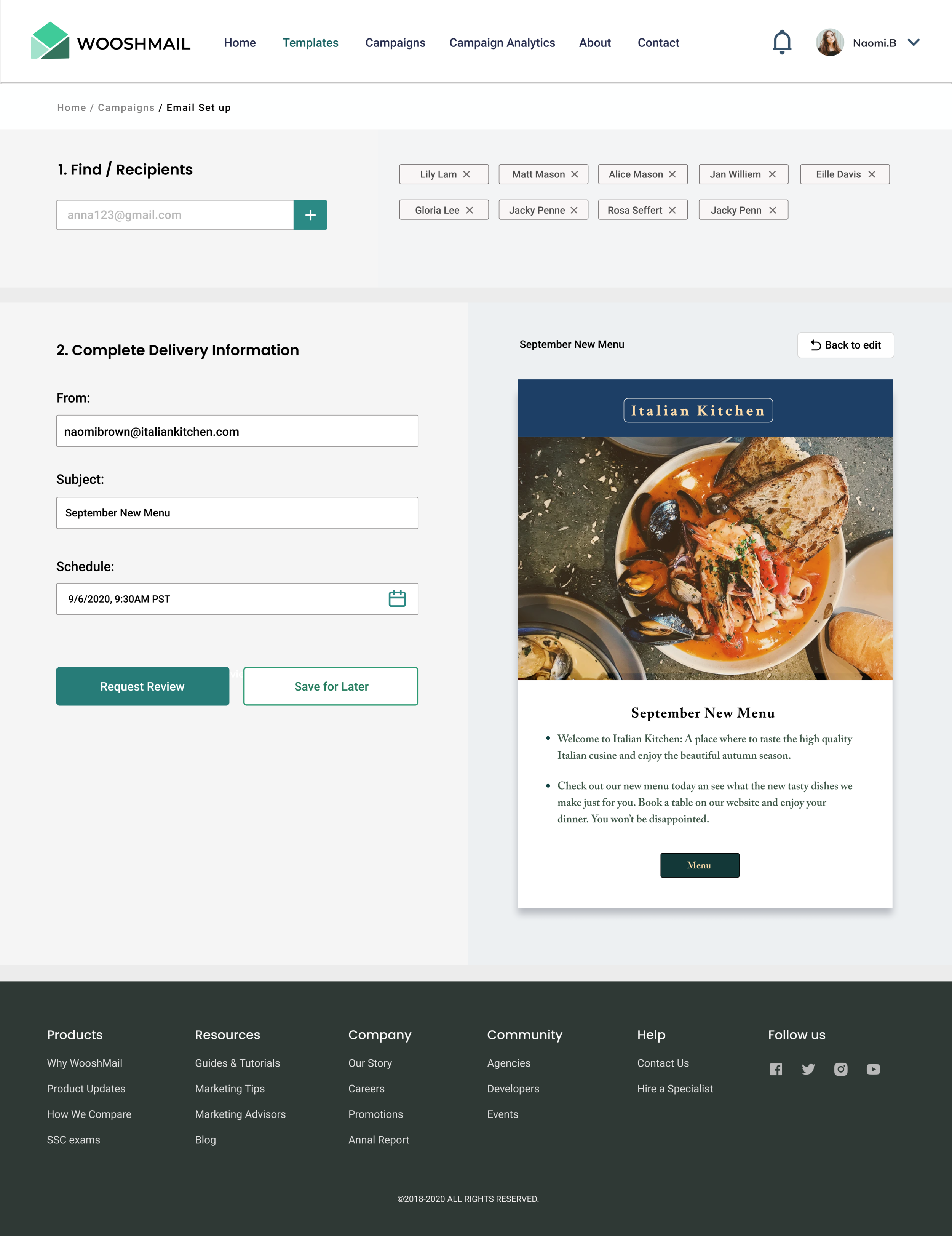
Add Recipients Page
On this page basic users will add recipients and complete delivery information before submitting their email campaign to be reviewed by admin users to ensure it complies with company standards.
This page includes:
Navigation
Email information setup
Add Recipients
From
Subject line
Scheduling date and time
Request to have email reviewed
Footer
Review and Send Email Page
On this page basic users will be able to review feedback from admins and make corrections where necessary. Once an admin user signs off on the email campaign, basic users are able to click "Send Email” to initiate the email campaign.
This page includes:
Navigation
Email template
Admin comments
Email delivery summary
Initiate email campaign
Footer
Campaign Analytics
After the email campaign has been sent out, basic users can use the campaign analytics page to view, download, and share campaign statistics.
Navigation
Campaign Statistics
Emails opened
Emails clicked
Bounce rate
Campaign graphs
Sharing tools
Footer
Design Mockups - Admin User Role
Template Gallery Page
This page allows admin role users to create a new email campaign using a selection of pre-made email templates. The page also provides a list of current email campaigns active for the business.
This page includes:
Navigation
Email template gallery
Current campaigns
Footer
Edit Email Template Page
Once the admin role user selects an email template they can use edit tools to adjust the look and feel of their email campaign. When the changes are complete, users can click the send button to continue to the next step.
This page includes:
Navigation
Chosen template
Advanced editing tools
Footer
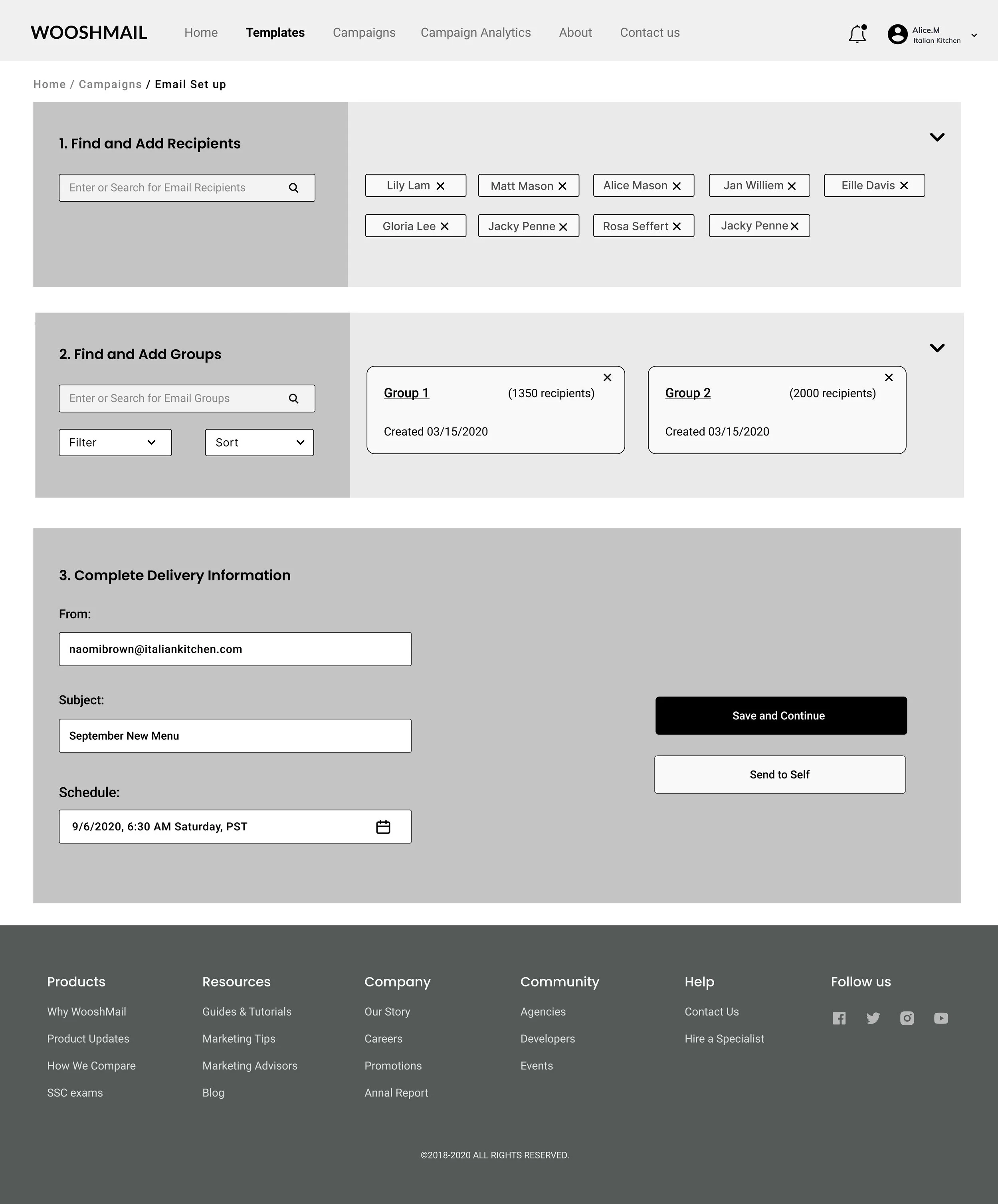
Add Recipients/Groups Page
On this page admin users will add recipients, groups, and complete delivery information in order to send themselves a test email or clicking continue to review and initiate the email campaign.
This page includes:
Navigation
Email information setup
Add Recipients
Add Groups
From
Subject line
Scheduling date and time
Send to self
Footer
Delivery Summary
This page provides the admin a review of the email campaign with the ability to go back and edit or if everything looks good send emails to recipients / groups.
This page includes:
Navigation
Email template
Email delivery summary
Edit campaign
Send emails
Footer
Campaign Analytics Page
The admin user has access to see the analytics for all email campaigns and can search for specific email campaigns by name and dates. The admin user can also download, print and share this page.
This page includes:
Navigation
Campaign search
Campaign Statistics
Emails opened
Emails clicked
Bounce rate
Campaign graphs
Sharing tools
Footer


