Travel Rental App Design
Travel Space is a startup company that focusing on developing a travel app for travelers’ use. Based on users’ needs, Travel Space provides global hotel booking, travel recommendations and car rentals to help users the next dream destination come true.
Assumptions
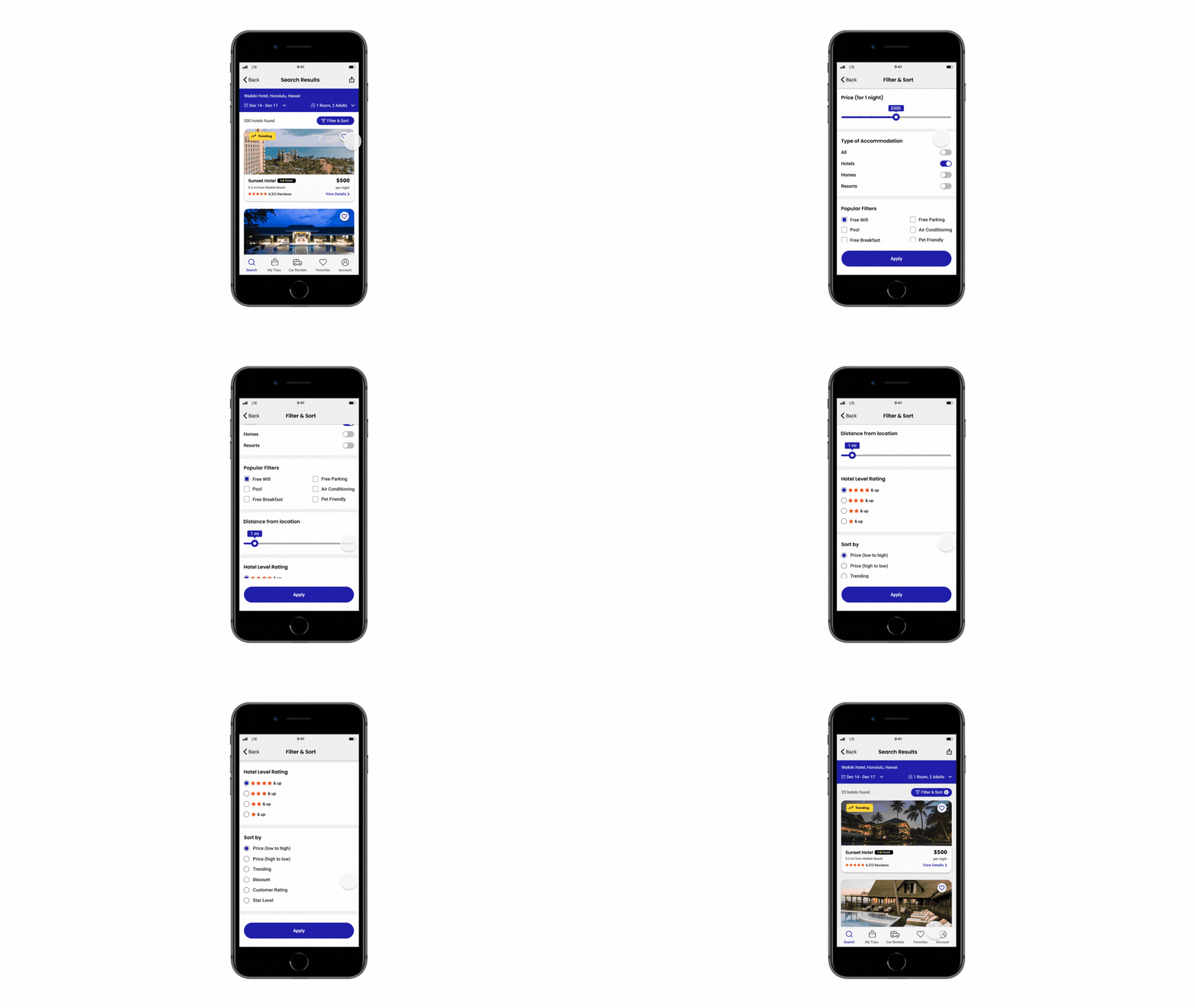
Users prefer to be given choices to filter what type of places they would like to book, such as price, free park and air conditioning.
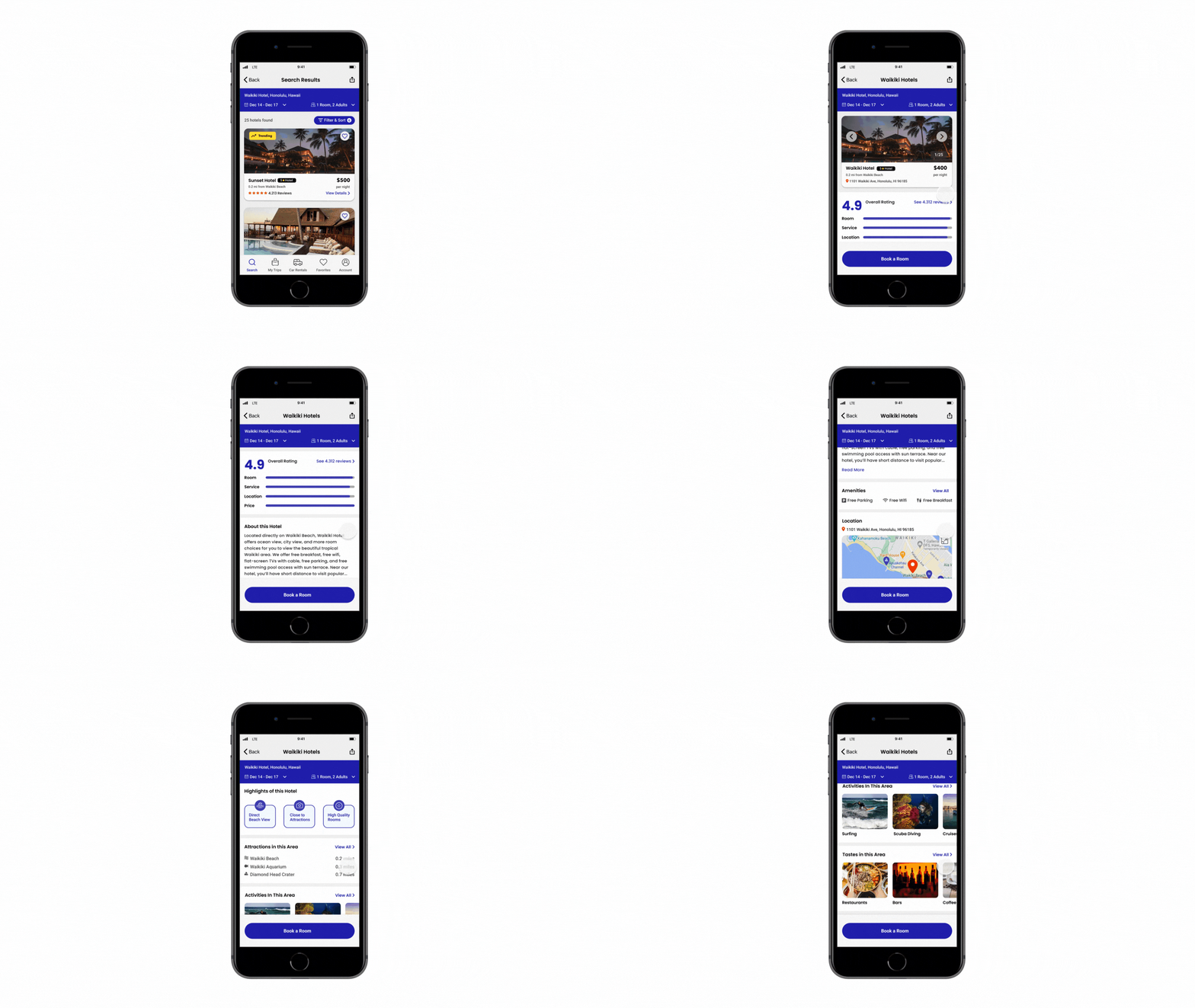
Users gain confidence to book a hotel room based on detailed hotel descriptions, photos and positive customer reviews.
Users want to know more about the location and what they can explore in the area when booking a hotel room.
Users would like to share the hotel information with friends and family and hear their opinions.
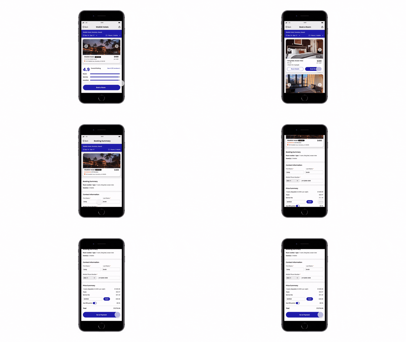
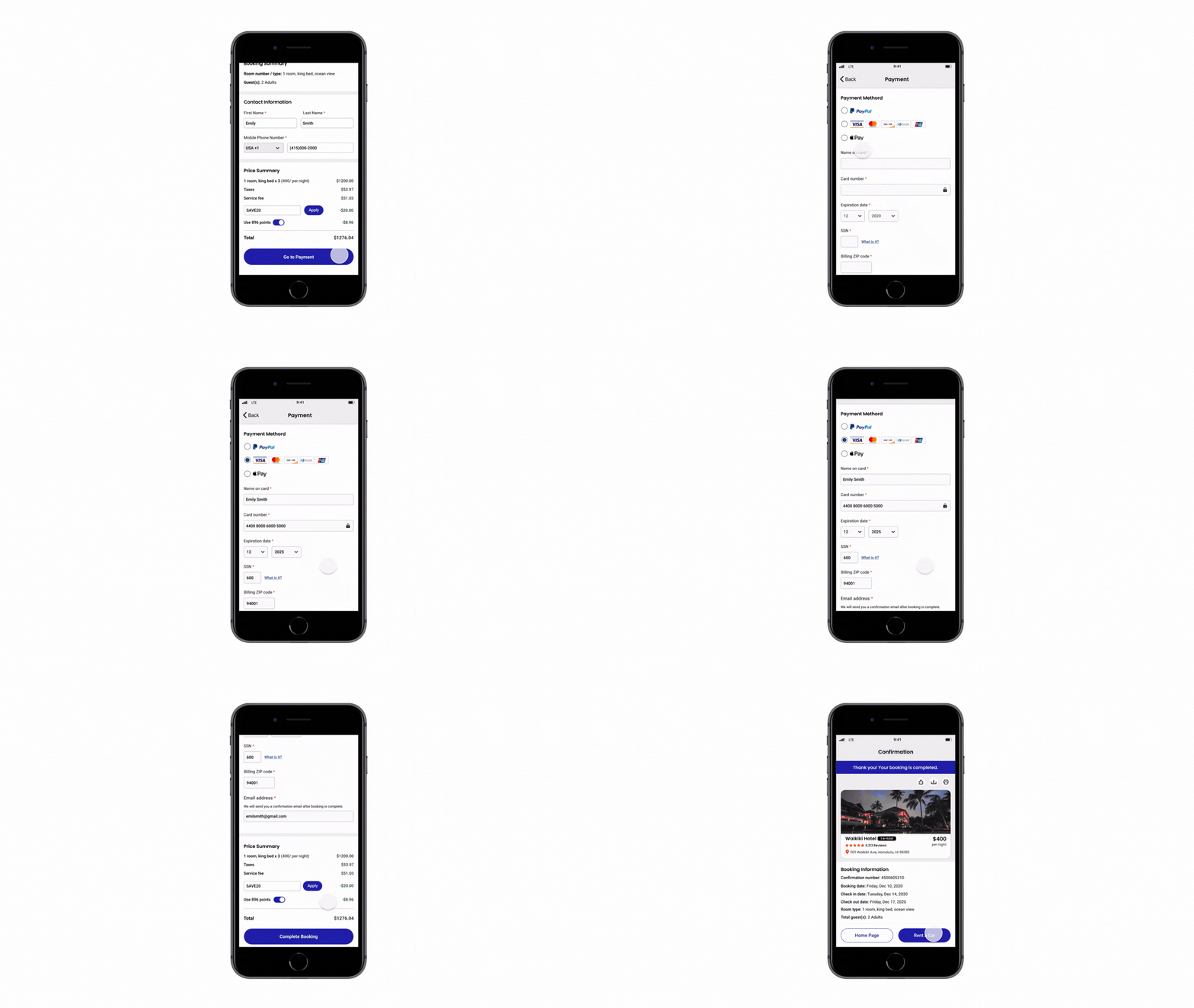
Except receiving a copy of booking information in email, users think it’s easier for them to find the booking details and review the booking history in the app.
Users like the “favorite” feature. They can first view and save the hotels they like then make decisions later.
User Personas
Empathy Maps
Once the personas were created, I developed an empathy map for both Emily and Steven. The empathy map allowed me to further understand my personas’ pains and needs, as well as seeing their state of mind when it comes to planning for a trip and hotel booking.
Sketches
After identified the user persona and empathy maps, I was ready to start sketching wireframes with key features that aim to solve the main problem. I used Balsamiq to create sketches that show the features and UI elements for each screen. Using Balsamiq is an efficient tool to create organized sketches plus Low Fidelity Prototype for the next step- usability testing. I also created a usability testing plan and checklist that included the main goals I was looking to achieve.
User Testing
Test if participants are able to easily search for a destination, pick dates, and the select the number of rooms.
Learn if participants are able to easily filter and sort their needs.
Learn if participants are given important and necessary information regarding the hotel details without being overwhelmed.
Find out how satisfied participants are with the overall experience of a hotel booking process.
Does the user understand the functionality of all features and buttons of the app?
prototypes
During the usability testing, I interviewed five interviewees and wrote down the pros and cons, their concerns and suggestions. I first modified uncleared features and parts that could be improved, then I created more detailed UI elements in Figma for the High Fidelity Prototype to better present the app.
Design Mockups
Based on my High Fidelity Prototype, I moved on to the next step- design mockups. I first identify Travel Space’s brand as clean, modern, and visual-focused. I chose lavender blue ( purple and blue mixed ) as a primary color that brings a relaxing feeling, trustworthy and reliable impression to users. As for typography, I chose Poppins- a popular geometric sans serif as header font,
Sticker Sheet
Final Design Mockups
Full Screen Design Mockups
Device Mockups
It all begins with an idea. Maybe you want to launch a business. Maybe you want to turn a hobby into something more. Or maybe you have a creative project to share with the world. Whatever it is, the way you tell your story online can make all the difference.
Interactive Design Mockups
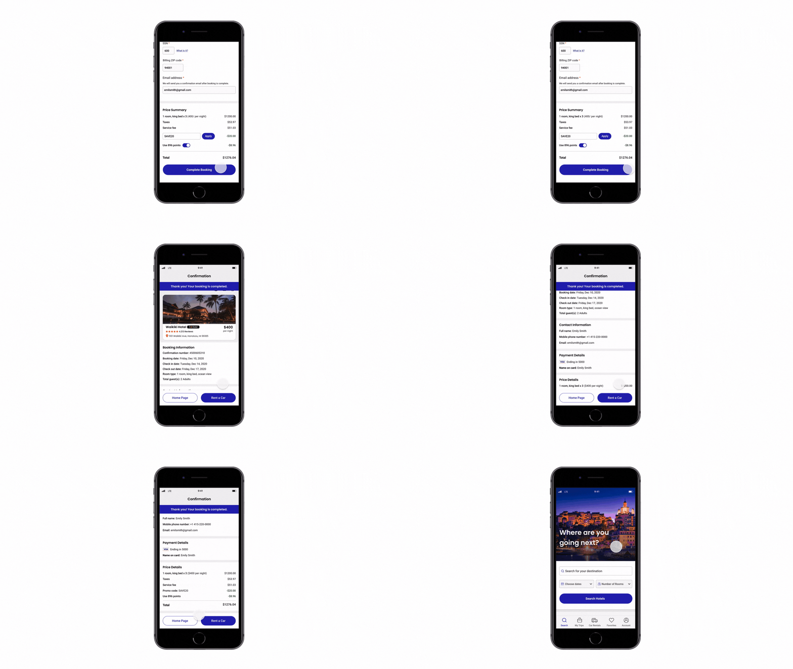
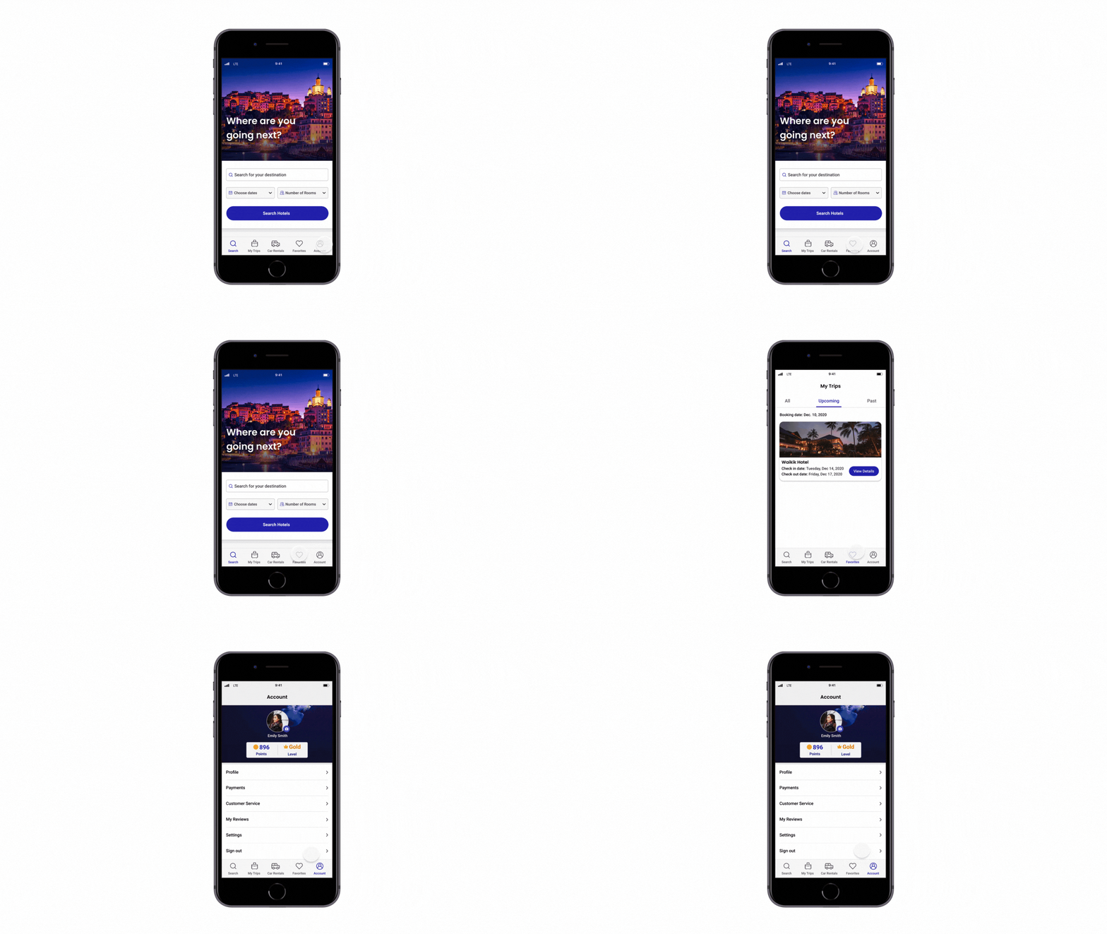
Lastly, I created interactive prototypes in order to fully display the entire screens and the features. I also added a couple of new sections in screens that enrich user’s interests and exploration when they use this app.
